It’s hard to use the right font. However, it’s always important, especially in email marketing. Explain what to use and what to avoid to make your newsletter more readable and professional looking.
Divide fonts into serif and sans serif
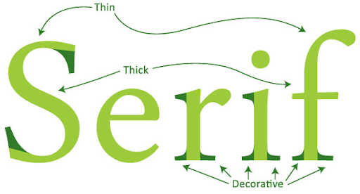
Let’s start with a small theory. Typically, fonts are first divided into serif and sans-serif fonts. serif fonts are generally considered traditional. There is a thin line at the end of the stroke of a letter or symbol. It is usually used in print rather than internet pages because it is easy to read on paper. Sans serif fonts are common on the Internet. Simple font with no extra lines. Sans serif fonts include Arial, Helvetica, Calibri, Century, Gothic, Verdana, and Tahoma.
‘Safe’ Fonts for Email Marketing
Note how different devices render messages in slightly different ways. Not all devices support the fonts used to design the newsletter. So what happens to the chosen font? It will be replaced by another font that the device can display. This means that using the wrong font can lead to lost ideas. To avoid this, you should use “safe” fonts that are installed or supported on all devices and displayed in all browsers. Among all email providers, the most commonly used security fonts like Arial, Helvetica, and Times New Roman are the most popular. , Georgia Comic Sans, Courier are also safe, but will be back later. With a safe font, your subscribers will see the same text you designed when you included that font in your newsletter.
Font for used
The content of the message should be readable. This should be the main consideration when choosing a font. Here are some examples of fonts you can use in your designs without worrying about being hard to read.
The Arial font is one of the most common and easy-to-read universal layouts for email newsletters. Unfortunately, Arial also has a small downside. This means that there is very little space between characters. This can mean that text can be difficult to read on low-resolution devices.
Helvetica fonts like Arial are some of the most popular online. Without a doubt, Helvetica’s greatest strength is its universality and the fact that it applies to any graphic design. If you want your designs to look modern and simple, use Helvetica. However, like Arial, the biggest complaint is the lack of space between characters.
Verdana font is praised for its readability by adding spaces between letters. Sans serif fonts display well on your computer screen, ensuring your original design is transferred. followers too. For example, if you want to add a classic touch with a traditional font reminiscent of printed web pages, use a serif font.
Times New Roman is a classic typeface found in books and magazines and is often criticized for being drab, boring, and difficult to read due to the small gaps between letters. Don’t let this put you off. It’s famous and popular, but for good reason. Not only does it look good, but it’s universal across nearly all the devices your followers use to read your email, so you can be sure it’s displaying correctly. Georgia Fonts Like Times New Roman Georgia is another classic version of an easy-to-read serif font with proper spaces between letters.
Fonts to avoid
The license font are carefully selected and designed. You shouldn’t be the most important aspect of email marketing, unnecessary additions distract you from the essence of your message. Use a different font for the text following the title. Using a different font in a title isn’t a bad thing, but text that conveys the essence of the message is often reserved for simple typography. However, there are some fonts to avoid. It’s best to avoid flashy and hard-to-read stuff. Fonts that may cause problems for readers are: Brush Script Fonts look good, but are difficult to read in long text.
Bradley Hand Fonts Other fonts that simulate handwriting have similar problems, such as Bradley Hand. You should also be aware of other “gorgeous” fonts that may break or make the overall design of the text difficult to read.
In addition to hard-to-read fonts that don’t display correctly on different devices, there are three fonts you should be aware of that you should avoid in your campaigns. your email marketing
Comic Sans font, don’t use Comic Sans if you want to be taken seriously. Even if it’s a “safe” font and always visible, it’s best to avoid it. The reason is simple: looks young and unprofessional.
Courier new font, another option to avoid in your newsletter. Express delivery is a machine-made technology. This is a monotype font, which means that most characters have the same width. Its advent made it possible to write computer code instead of writing ads.
When writing your message, you may want to reduce the importance of appearance. Choosing a widely used “safe” font in your message that is easy for recipients to read and access will allow members to see the same message you have designed. However, if you need to use a specific font for your message, it’s important to note that not all recipients will see exactly the font they need. Also, keep in mind that the font should match the look of the text. Mostly, it refers to the simple and easy-to-read fonts of the sans-serif family.
