The Rise of A24: A New Kind of Studio
When people choose which movie to watch, they might check who the director is or who the actors are. However, recently, people have started watching movies because of a studio. Imagine if someone 10 years ago said you should watch a movie because Paramount made it. What would that have to do with anything? But nowadays, with the growing A24 fan base, many people watch a movie simply because it’s produced by A24, which has gained a reputation for films that are cool, weird, and original. For them, the A24 logo in the opening credits serves as a stamp of approval for a good film.

From Directors to Studios: A Shift in Influence
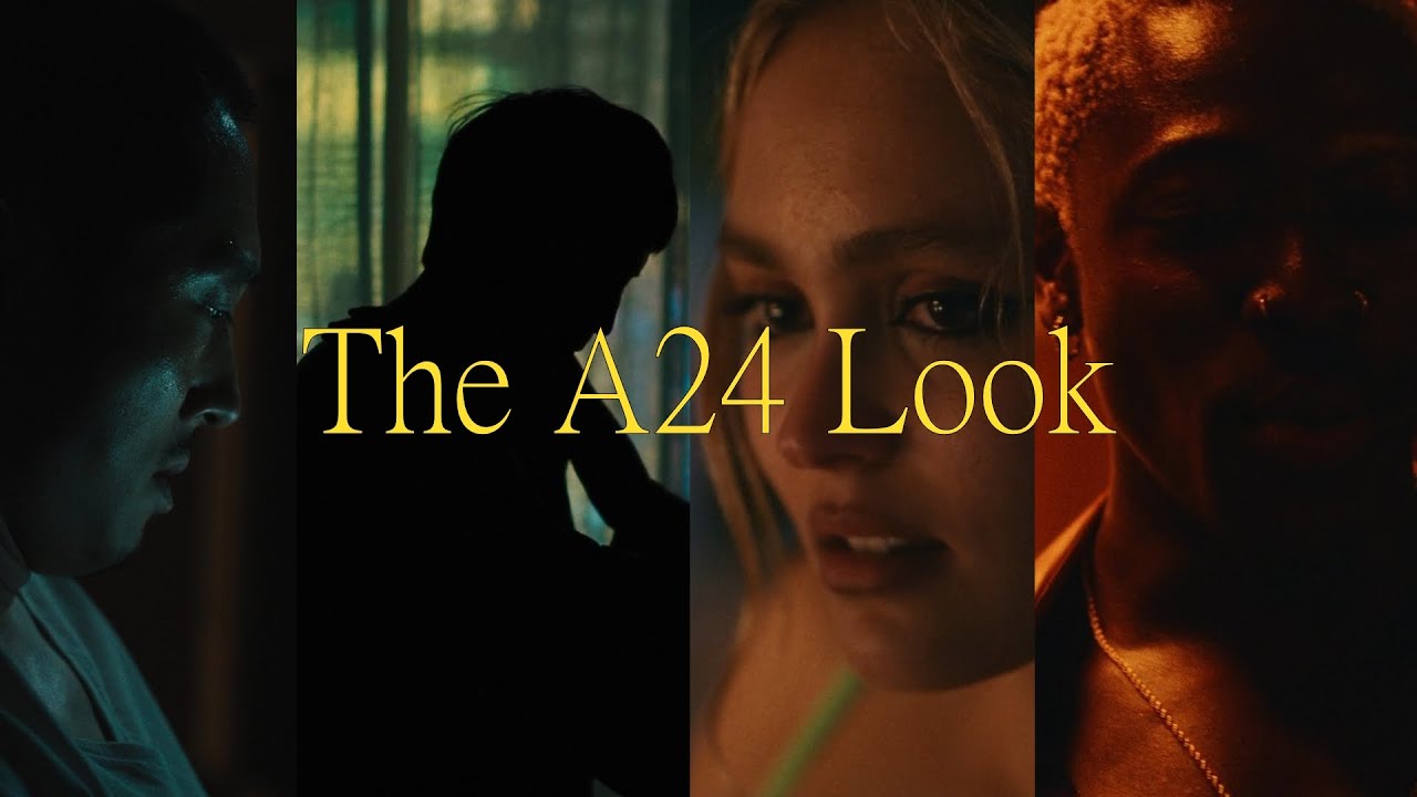
So, what has changed? In many movies, the directors typically dictate the style of the film. For instance, when watching a Quentin Tarantino movie, one can anticipate stylized violence, sharp dialogue, nonlinear storytelling, pop culture references, and an eclectic soundtrack. However, with A24, it’s not just the directors that establish the style; it’s also the studio itself. This style is evident in the majority of their films, so it’s not surprising that you can often recognise an A24 movie upon viewing it.
The Birth of an Iconic Style: “Spring Breakers” and Viral Marketing
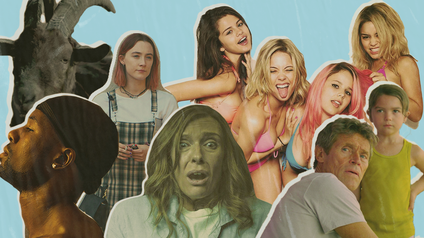
The roots of this style trace back to 2012, when the A24 studio was founded. One of their main principles when starting out was that they wouldn’t use any forms of traditional marketing because it’s expensive. Instead, they opted for cheaper, viral forms of marketing. To execute viral marketing effectively, their movies had to be crafted for social media virality, and with that, the movie “Spring Breakers” was born. In this movie, four college girls hold up a restaurant to fund their spring break vacation.
What makes it more intriguing is that these roles are portrayed by former Disney starlets, which was quite a surprise for teens who were accustomed to seeing them in wholesome entertainment now watching them embark on a mischievous adventure.
“Spring Breakers” was the first A24 movie that most people saw, and it’s a very good example of an A24 style. It also had a lot of memeable sequences, which helped in the marketing aspect, leveraging memes to get the movie buzzing without spending money on traditional forms of advertising.
The movie has a strong artistic vision from the director, Harmony Korine, who stated that he wanted to make the film appear as a mixture of a Britney Spears music video and a Gaspar Noé film, and he very much succeeded with it. These striking visual choices and neon colour palettes became the recognisable symbol and visual language of A24 films.
Distribution vs. Production: A24’s Evolution
A24 is not about the plot; it’s about the lighting. If it doesn’t look like it was filmed in a TikToker’s basement, We are not watching it.. At this time, A24 was still primarily a distribution company. Unlike traditional movie studios, which typically handle both production and distribution, A24 focuses solely on distribution.
They would find independently produced movies that aligned with their principles and buy the distribution rights for them. Then, they would do the marketing for those movies and make deals with companies that could show the movies to audiences.
After four years of working this way, A24 started producing their own movies. Running around catching that light in “Moonlight,” which was the first movie they both produced and distributed, was a big success both commercially and critically. “Moonlight” won Best Picture. If we look at its style, “Moonlight” has that classic A24 vibe—a distinct character-focused story and lots of neon and subjective lighting.

Artistic Vision: The Core of A24 Films
But why is it that many other A24 films also have that same artistic visual vibe? It’s connected to certain characteristics that contribute to a cohesive feel in their movie catalogue:
- Artistic Vision: A24 tends to work with filmmakers who have distinctive artistic visions, resulting in films that share thematic and stylistic elements.
- Narrative Depth: Many of their films explore complex themes and character-driven narratives, which creates a similar depth of storytelling across their lineup.
- Focus on Independent Filmmaking: A24 primarily distributes independent films, which often prioritise creativity and unique storytelling over commercial appeal. This focus leads to a similarity in tone and approach across their films.
- Innovative Storytelling: A24 is known for supporting innovative and unconventional storytelling techniques, which can create a sense of similarity in the way stories are presented to audiences.
- Target Audience: A24 has cultivated a specific target audience that appreciates thought-provoking and emotionally resonant cinema, leading to a selection of films that cater to similar tastes and preferences.
Lighting and Cinematography: Crafting Subjective Stories
In the process of making a movie, filmmakers are presented with a choice: tell the story in an objective way that is detached from a character or in a subjective way that replicates the character’s point of view and the emotions they are experiencing. If we get back to those five characteristics of A24 films, it’s completely logical that most of their filmmakers will opt for subjective storytelling, which inherently calls for a subjective approach to cinematography.
One cinematography concept that can be used to tell a story in an objective or subjective way is lighting. Objective storytelling is achieved with naturalistic lighting. For more subjective stories, cinematographers employ more expressionist lighting techniques. This can include using RGB lights or adding colour gels to add different hues of light to a scene.
Using vibrant, exaggerated colour lifts the stories beyond reality, capturing the mood or perspective of a character in that moment rather than merely presenting the world as it is. Given that most A24 films are character-focused, it’s understandable that they often employ more subjective lighting, contributing to a cohesive visual vibe and the feeling that their movies look somewhat similar.
While there are exceptions, such as “The Lighthouse,” which despite being black and white still utilises subjective and artsy cinematography connected to A24, or, to put it this way, if another A24 film like “The Green Knight” had to be filmed in black and white, it would look just like “The Lighthouse.”

Beyond Movies: A24
A24’s Foray into TV with “Euphoria”
But A24 doesn’t just make movies; they make TV shows too. A lot of people who watched “Euphoria” didn’t know it was produced by A24, but when they found out, it made perfect sense. The cinematography just screams A24. This distinct visual style played a big part in the show’s success. But the look isn’t hyper-stylized just for the sake of being hyper-stylized. It’s crucial to helping the audience understand what drives the characters. The filmmakers of “Euphoria” wanted to achieve something they call emotional realism. They wanted to show the extreme highs and lows of adolescence visually, even if those visuals didn’t adhere to physical realism.
Adapting to Different Settings: The Visual Contrast in “Hereditary” and “Midsommar”
This look of emotional realism is easier to create when you have the locations and occasions, like in “Euphoria,” but what if it’s a project where the setting just doesn’t allow for fancy set design and lighting? “Midsommar” is a good example of this. Although made by the same director and cinematographer as “Hereditary,” which was their first feature film, “Midsommar” is completely opposite in the visuals.
With “hereditary,” they were pursuing this look that was almost too dark. With “Midsommar,” they were doing the exact opposite, seeing how brightly they could push the movie. For “hereditary,” they had a house that was built and could control the lighting any way they wanted. For “Midsommar,” they were filming on an open field.
Despite being shot in the field with no opportunities to use fancy lighting, they still created a style that stands out from other movies with similar scenery. The difference is that this time they had to rely on lenses and colour grading to create that dreamy pastel look.
The Ultimate Visual Experience: “Everything Everywhere All at Once”
We could discuss the cinematography and colours of every A24 movie ever made, but why not focus on one A24 film that has every style? Imagine you have to create a specific visual atmosphere for the film world from scratch. Now multiply this by 50. That’s what they had to do for “Everything Everywhere All at Once.”
In order to craft a multiverse that feels both cohesive and distinct across its myriad dimensions, the film doesn’t just try to visualise the coolest and most extraordinary looks. Each universe is meant to encapsulate the emotional state of the character. If it’s a reality where the protagonist hates being in, the filmmakers use this Netflix comedy look with flattering colour grading and ketchup mustard tones, which goes well with the bizarre reality.
Compared to this, the reality in which Evelyn is an action star needed to be hypnotic and alluring, while the so-called Alphaverse, where people develop crucial technology to track the direction of other universes, possesses strong Star Wars vibes. The filmmakers utilise all available tools to visually distinguish between the different worlds and support the narrative. For instance, in the opening scene, they employ mixed lighting to underscore the chaos in the protagonist’s life. She struggles to focus on anything, and the juxtaposition of cold and warm lights within a single room intensifies this feeling.
To Wrap Up
With that many worlds with unique but still similar aesthetics, “Everything Everywhere All at Once” might just be the perfect example of how all A24 films look the same but different. If you want to make your videos and photos look like A24 movies, check out the collection of movie LUTs and Lightroom.
